Wednesday, 15 December 2010

Final CD cover and evaluation


Evaluation of CD cover
Overall i am very pleased with my CD cover! I didn't think it would work out as well as it has done as the photo shoot was a bit of a rush and i had to change my model as she was'nt there on the day i needed her. I think that the way i have edited the images has contributed a lot to making the CD cover look good and i have followed a similar colour scheme in the photos and CD cover itself. I went a step further and actually created the cover by printing it out and sticking it all together. I wouldn't of done it without Marie's help, thank you Marie babes!    


CARMEN GREENACRE!

These are my final images that i used on my CD cover. I am really pleased with them as i think they look very effective even though they are quite simple. I love the faces Carmen has pulled as i think it makes her look like she has attitude and it shows her own personality instead of 'staged' photos. I think by changing the effects of the images they look more interesting as it shows shadow and highlights parts of her more than if i hadn't edited them. My favourite image is the front cover as i think Carmen looks gorgeous! I think it stands out more as i've edited it green and the other images are all similar colours and the green shows really nice shading and light and dark parts of the image. 


 Final CD cover


Photo's i could of used for my CD cover
Practice shoot! 


These images were a practice shoot for our CD cover and they have worked really well. In the end i didn't use these as i came up with a different idea but it was very fun playing around with this shoot in the studio. If i had edited these images at the beginning i may of used these for my CD cover as i really like them! Using the photo frames over our faces works very effectively and almost makes it look 3D. With the photo of Connor, Joe and Dave we were messing around with the flag and blew the fan on it not meaning to blow it into the shot but it works really well and looks like we have intended to do this. 


CD cover research


Wednesday, 10 November 2010

Band Posters and Flyers-different layouts


I really like this Michael Jackson poster because i think it works effectively with just the 3 images of him.   The way the first and third image are quite similar works like a pattern and the second image splits this up creating a difference in the photographs as he is looking a different way. This makes the second image really stand out from the rest.  


This poster of Florence and the Machine is quite simple and the colours are all very similar but i think this creates a good effect. I like the way the yellow,white and pink flowers stand out against the rest of the poster as they are the only vibrant colours. I also like the simplicity of Florence stood against the wall and by her holding a rabbit as it adds an unusual and unique style to the image.


This Oasis poster is quite dull as it's just black and doesn't have any colour but this works effectively against the reflective shaped photograph in the middle. I also like the small amount of writing on the cover which makes the image stand out more.


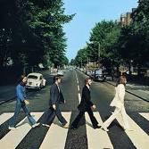
This is a Beatles album cover and i really like the way the simple colours that have been used, black and white, this works well against the interesting photograph on the cover. It's quite a simple cover but it's eye catching how the men look really big against the small background.

This is my favourite album cover out of the ones i have researched as i love the colours and the lighting. This image also makes Florence stand out as the lighting emphasizes her in the centre of the album cover.

Wednesday, 3 November 2010

CD cover design task


First CD cover 
This was a practice CD cover just to test making one. We chose any picture off a website and a random quote and name off wikipedia, this was to have an image and create the name of the CD cover and the band.


Introduction to CD cover photography 
We have been asked to design and create a CD cover or poster for a band. We should show our developing ideas, photo shoots that we do and all design work. We need to think of what band were going to create the CD cover or poster for or weather it's going to be a solo artist. We need to research CD covers and posters/flyers to give us an idea of where to begin. 

Wednesday, 20 October 2010

Evaluation to creating the blog

I have practiced in the studio doing a photo shoot and have paid a small part in making a video. The photo shoot was really enjoyable as i liked finding out how to work in the studio and using the studio camera which creates very focused photos. I am still getting the hang of using my blog, uploading things, inserting labels etc but i am getting the hang of it. I am enjoying this blog assignment as i like the way we can take photographs and put them on our blogs saying how we did it and what we like about it so we can state our own opinions. I also think it's a change in our way of working by making a blog on the computer and i like the change so we aren't always working in sketch books.

Florence + The Machine - Dog Days Are Over

Practice - poster shoot


This was our first practice shoot and i think it worked successfully for saying it was the first time we had used the studio. We went into the studio to practice what it's like in there taking photos and playing about with the lighting and props. These photos interlink with fashion photography as the lads are dressed fashionably and the modern/retro props also reflect this. Some of these images such as the ones where there are all 3 lads in the photo are similar to the work of Gered Mankowitz when he photographs bands with more than 1 person. I was aiming to reflect his work in my work as i think his photos are interesting and different. Joe, Connor and Dave are brilliant models!